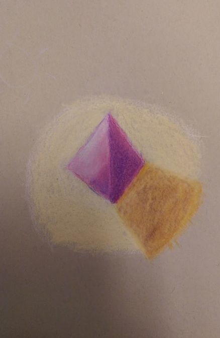
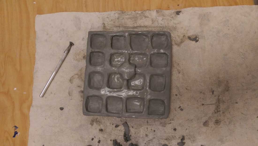
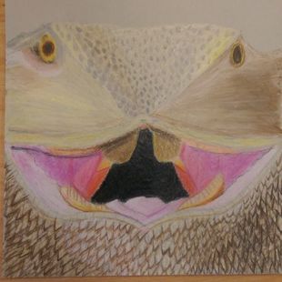
3. One of the most productive mini lessons was the prisma color objects lesson. Morgan explained very well on how to correctly add value to the shapes to create a 3D object, and I feel like I understood and was able to replicate it. I was also personally shown how to blend the colors together correctly, and where to place the lights and darks. Having to do this lesson three times also helped, since I believe repetition is important when learning a new medium. This lesson really helped with understanding how to use prisma colors as a medium, even though my final project was maybe not the best, I still feel like I have a slight grasp on them. (This is one of the drawings I made in this lesson, I thought it had a good range of value).
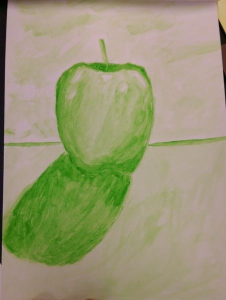
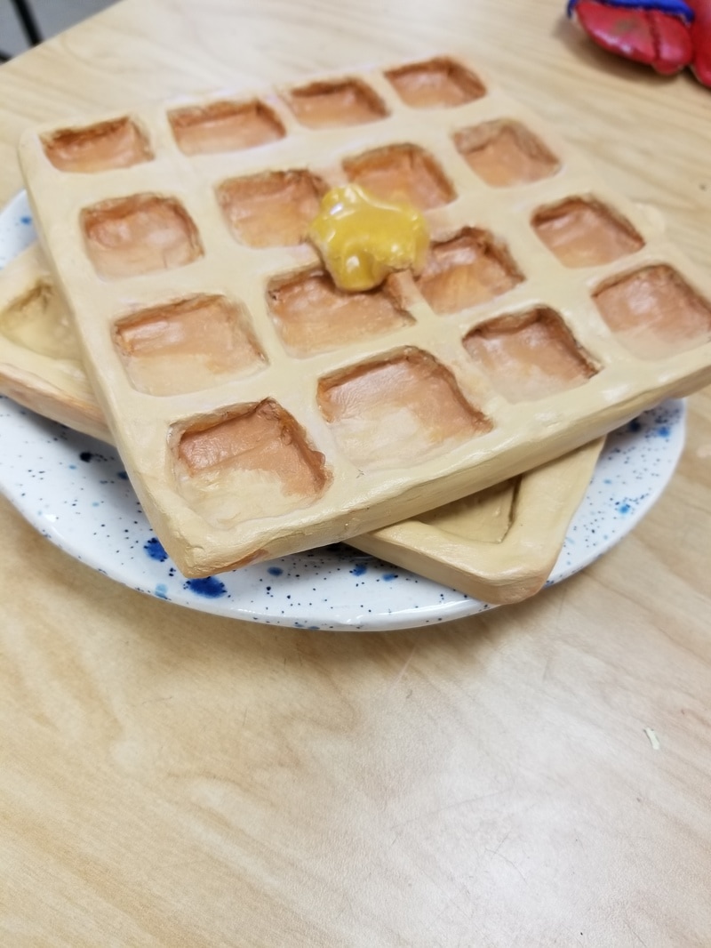
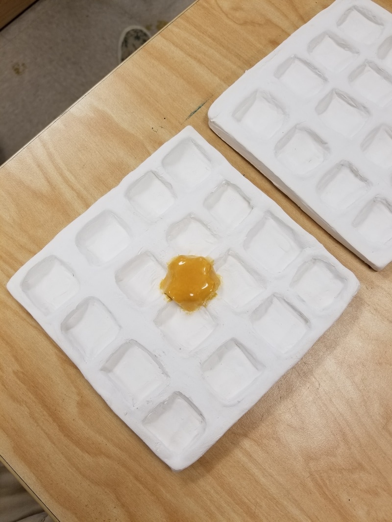
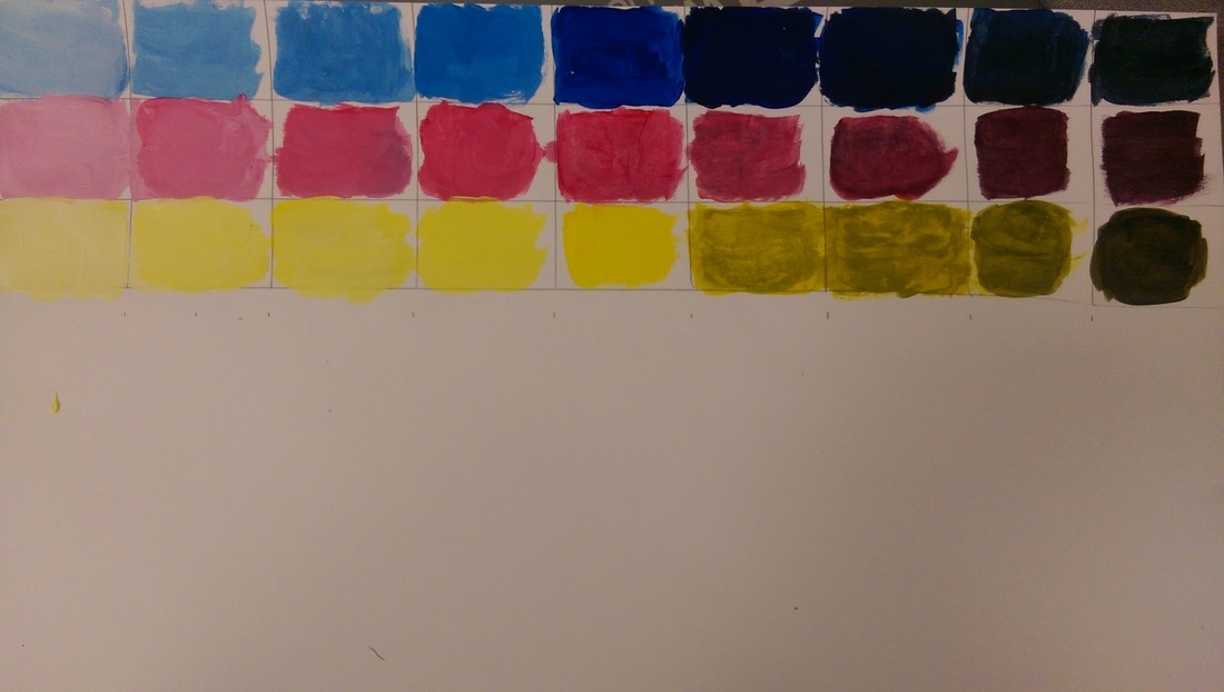
Another mini lesson I thought was very beneficial was the four watercolor apples and the techniques you had to chose with them. The one I thought was the best was the monochromatic apple, and that I taught me personally the most. As a lesson in general it was good because learning how to use value only using one color helped me understand value more, and the importance of starting light with water colors. The repetition of the water colors was also important to learning since doing them four different times with different techniques helped me gain a better understanding of watercolor through the repetition. I felt like i was instructed very well by you on how to correctly do watercolor, and that you explained how to use techniques very well for the whole lesson, due to showing the class how you would do an apple and I think this lesson reflects that. (Below is my monochromatic apple)
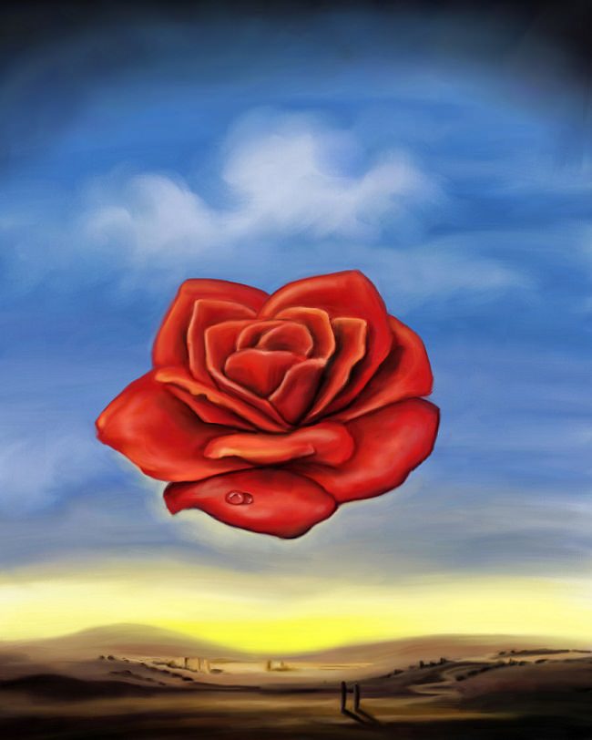
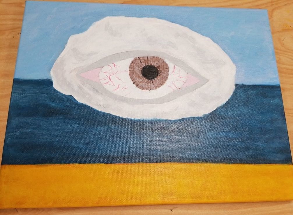
1. Out of all of my projects I felt that my landscape painting was the most successful, and completed the theme the best. The theme was to create a landscape painting in the style of a chosen artist that you had to research, and my artist was Salvador Dali. Salvador Dali was a surrealist artist of the early to late twentieth century, and I tried to replicate his style through color usage and a surreal object. The process I used was to layer a lot of paint on my canvas using dull colors that were similar to the ones Dali used in his artwork, for instance to add value to my ocean i continually added lights and darks multiple times until I got the desired blend of colors. To make my painting surreal I wanted to paint an eye in the sky similar to Dali's painting the meditative rose. I think that the eye is an element of surrealism and I was happy with how it came out. While my choice of material was quite limited, I think acrylic was a good choice for my painting, and I like the range of control acyclic gave since it let me fix mistakes I made easily, which was nice for one of my first paintings I have ever done. The thing I like the most about this project was the eyes iris I think the technique I was shown worked really well, which was to add lines across the iris then to blend them lightly. Overall I just enjoyed the project and thought it completed the theme the best out of all of my projects. (This is the painting I did)

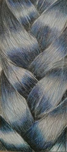
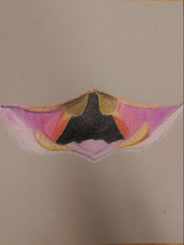
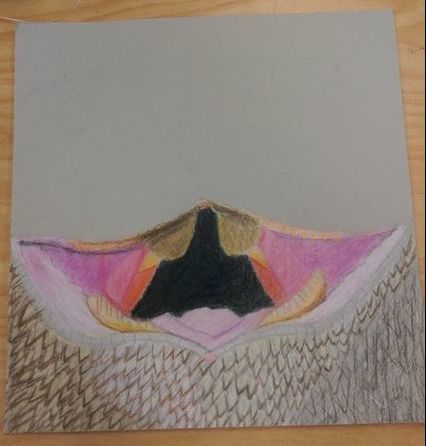
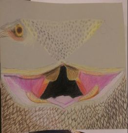
4. A really great piece of artwork is Amrutha's prisma color final project which was done as the upclose choice of the projects. This artwork shows an understanding on how to use prisma colors very well, it can be seen how much value she put into the piece to give the hair a very realistic look. Her usage of colors is also great instead of using normal hair colors like brown and black, she opted for a range of dark blues, which i think was an interesting and original artistic choice that greatly added to her piece. Her piece captured the whole purpose of the project which was supposed to be a focus on the textures of an object not the object itself, and she did this by using fine lines in her piece to give off the look of hair. This is also coupled with the amount of depth in her color palate gives a very realistic look to it. The blending of her colors is also done very well, which shows she knew how to use prisma colors correctly. I think this piece was definitely above and beyond while maintaining a lot of originality. It appears that a lot of work was put into the piece and care was taken with the composition of the piece in adding the values alongside with what image she chose to base her work off of.
 RSS Feed
