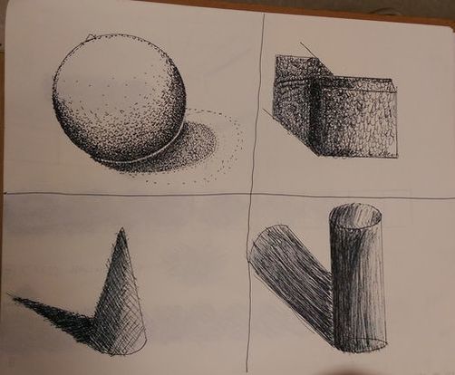
These are my four pen and ink forms, i used stippling for my sphere which is arguably the method i understood the most, the cone used cross hatching, the cylinder was hatching, and the cube i made my own method of using a u like shape.
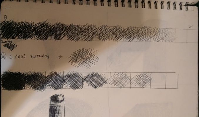
I was not here the day we did stippling so i only have my hatching value charts.
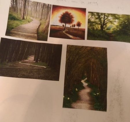
These are my 5 inspirational photos for my pen and ink project
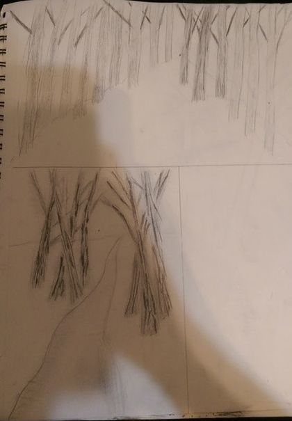
These are my reference sketches i decided to use the bottom one.
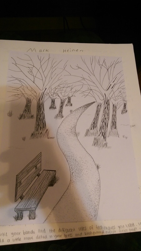
| THis is my in project photo for my final drawing, i was liking how the trees were looking at this stage, but sadly messed them up later on. | 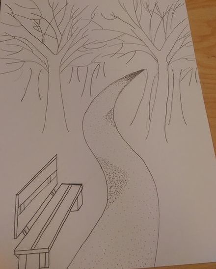 |
1. I decided to use primarily the inventive technique on my trees and bench because i thought the texture of wood would not be easily replicated by the normal pen and ink techniques. I used stippling on the path because i decided it would be better at creating a dirt like effect on the path, and created a better range of values on the path.
2. Texture is most important to give the subjects in the piece a sense of being realistic, I think this is best shown through my bench, the lines that create the pattern in the wood create a texture that looks as silly as this sounds wood-like.
3. Value is is very important in pen and ink since there is no color to use to make the highlights and the lowlights. Value is needed to created shadows and highlights in the piece.
4. I used one point perspective in my piece, i believe i did achieve this by using my path to end in the perspective point, and by lining up my bench with the perspective point. The mini lessons were helpful in learning perspective, they gave me practice in learning how to use a ruler to line everything up.
5. My craftsmanship is admittedly not the best in this piece, my trees could use a lot of work to look more realistic, and there is way too much white space on my page. One thing i could also put more craftsmanship into would be using a greater range of values on the path and other parts of the piece.
6. If i could recreate my piece i would redo the trees, I think they are the worst part of this piece. It was very difficult to draw the limbs of the tree, so if i was to go back I would have done more research on how to draw trees, and have done more practice drawing them before i put them on my final piece.
7. I learned a lot about value in this piece, and i believe that will help me in future projects to improve the realism of my future pieces. I also think perspective will help with my future projects. I did not know before this project how to use perspective to give artwork the correct dimensions, this will help my future projects look better by having the correct perspective in them.
 RSS Feed
